Quiz 2 material for ENSC 105W
-
Importance of graphics
-
A typical reader will look at
-
The title
-
The abstract
-
The introduction
-
-
Skim other sections based on need
-
What makes a good graphic
-
You need to properly introduce the graphic
- then having it explained and introduced the reader will under stand what the graphic means and the importance
-
Types of graphics
-
A lot can be considered graphics
-
To convey a message by means of drawing lines
-
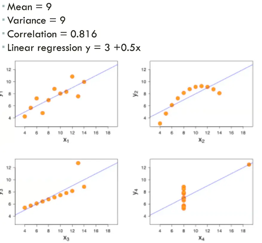
Number can lie
-
For example
- when looking at stats you can have 4 different data sets that average out to be the same but give out different values

Use Tufte’s measures to optimize graphics
-
Tufte’s measures
-
Maximize data-ink ratio
- data-ink ratio = data ink/total ink used in graphic
-
Keep it simple
-
maximize data density
- data density = # entries in data matrix/ area of data graphic
-
If comparing graph, merge
-
Avoid lie factors
- lie factor = size of effect shown in graphic/size of effect in data
-
avoid changing the graph to lie
recognize how to select the most appropriate graph type
-
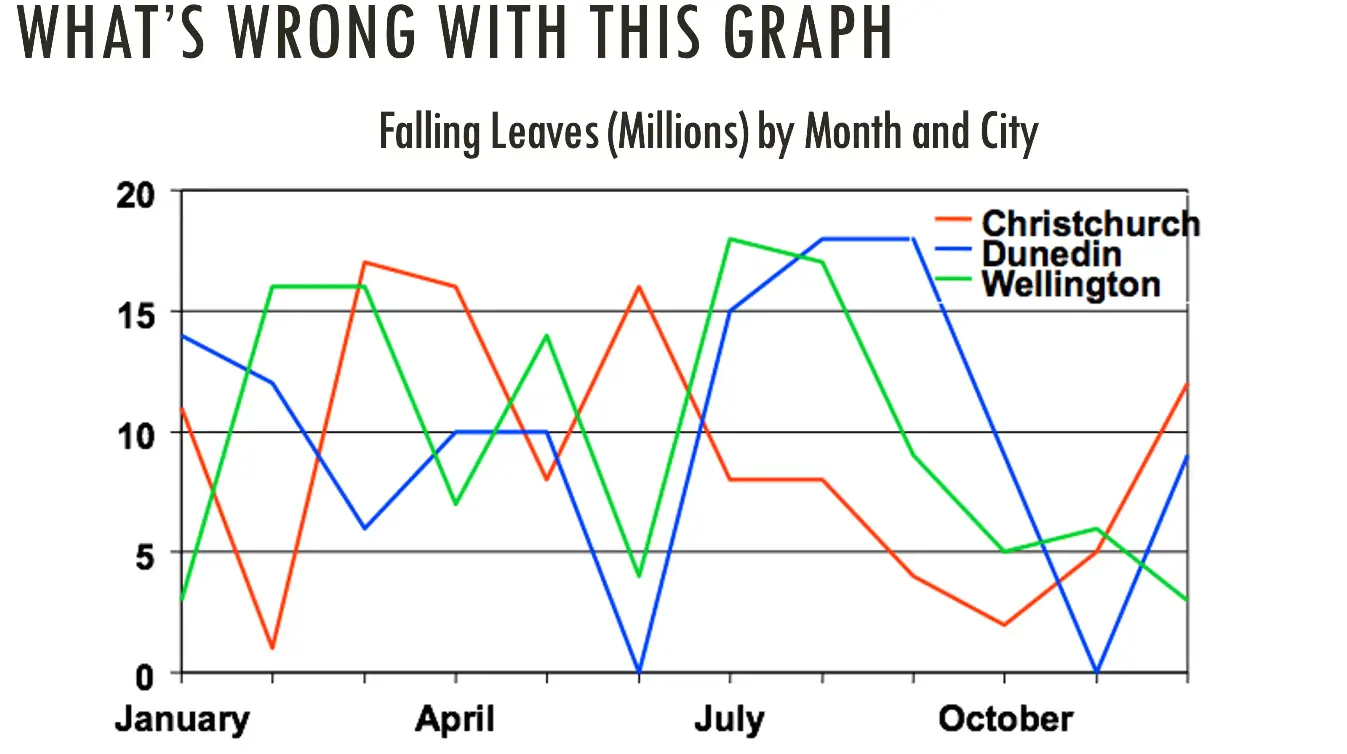
Whats wrong with this graph

-
Colours
-
using the wrong type of graph it should be a bar graph (by month)
-
types of graphics

-
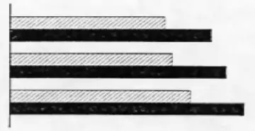
Bar graphs
-
Grouped bar:

- Compare relationships
-
Stacked bar:

- compare parts to whole
-
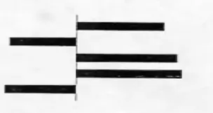
Deviation bar:

- difference from an expected value
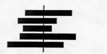
-
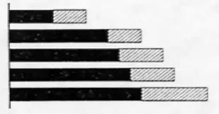
Sliding bar:

- how groups split according to some characteristic
-
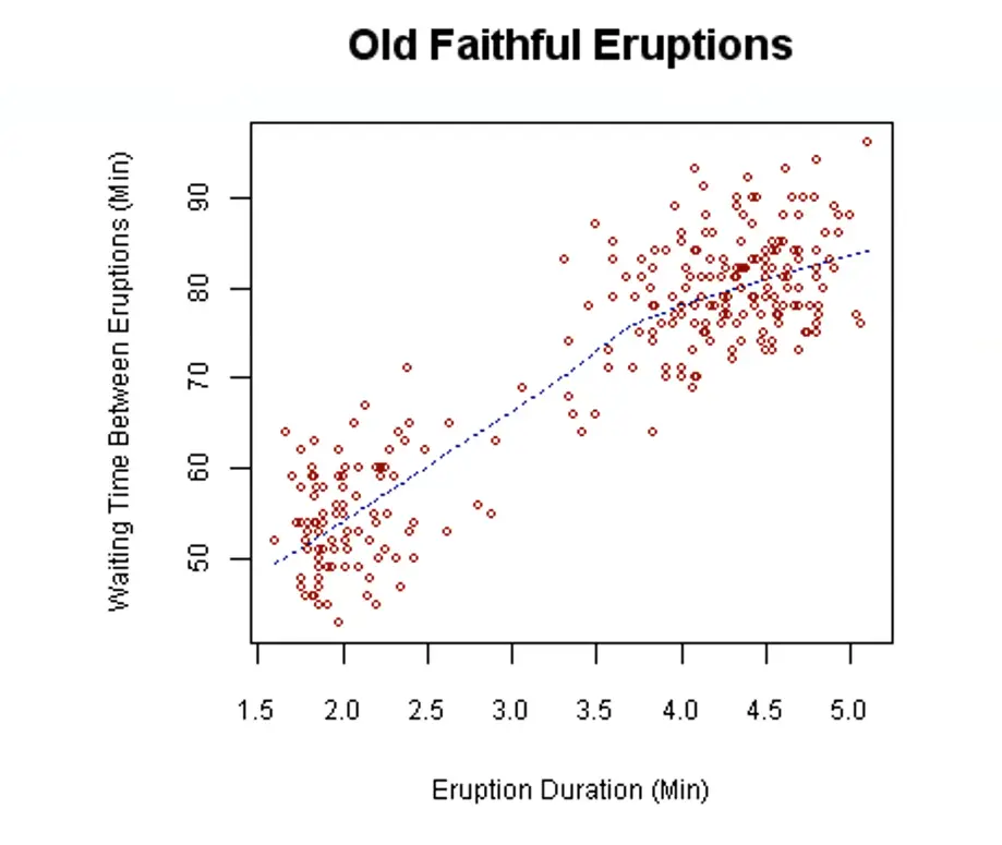
Scatter plots
-
Shows correlations between two uncontrolled sets of data

-
Pie charts
-
comparing parts to a whole
-
good for small number of segments
-
Colour
-
determine whether document will be reproduced in colour or black and white
-
keep in mind that people will often print in black and white
- avoid reference like “the red line shows”
- pay attention to contrast issues
-
general rule is that a diagram should be understandable reading a photocopied photocopy
Incorporate graphics into text and oral presentations
-
Ensuring graphical integrity
-
# of variables changing in graphic = # of variables changing in data
-
Use clear labels
-
show change in data, not change in designs variation
-
Show standardized units for money
-
Demonstrate cause and effect
-
Use the correct type of graphic
-
Graphics in oral presentations
-
Think PGP (particular, general, particular)
- introduced figure
- point to a particular data point
- describe the overall trend
- reinforces by explaining
Case study of Challenger
-
The disaster
-
the shuttle relied on temperature sensitive o rings
- many people did not see the damage and tempeture correlation because of the figure
